Welcome to Decipher Design
We work with inspired individuals like you!
We are a design obsessed, consulting, graphic studio that is dedicated to working with both small businesses and private individuals to help them realize their creative visions.
Learn More About Us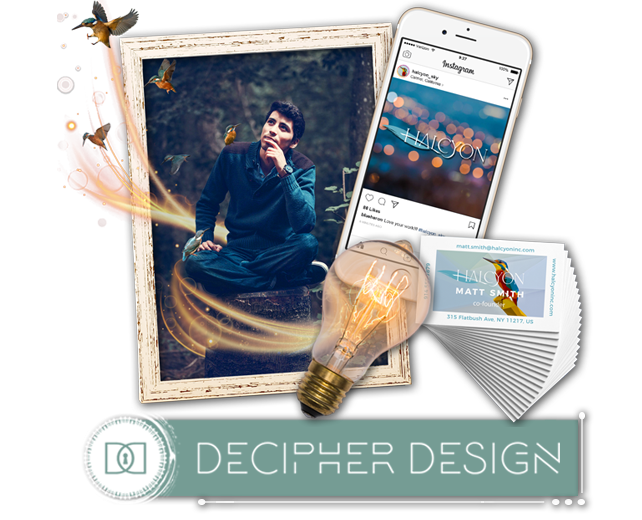
Make Your Idea a Reality
From concept to creation
We combine our creativity and design knowledge with your vision to build something unique together. The best designs are born through collaboration with our clients.
See Our Process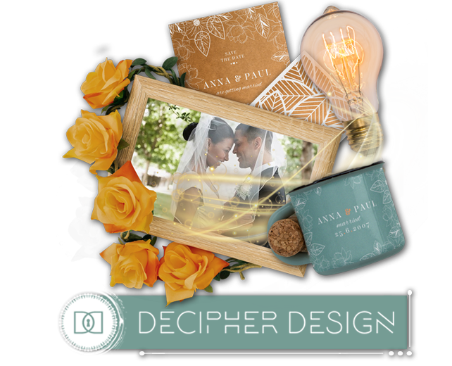
Unlock Your Potential
Your design is unique. Your idea is YOU!
Our studio exists to create timeless work that visually expresses the unique qualities of our clients through colors, patterns, logos, web graphics, and print style that will inspire you and your audience.
Explore Our Designs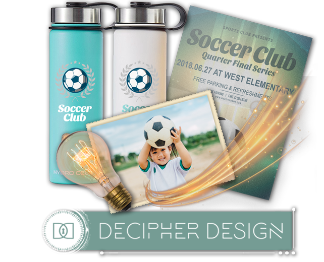
WHAT'S YOUR PROJECT?
Let's Make Something Great Together
Branding
Logos & Redesign
Business Cards
Stationary
Marketing Materials
Advertisements
Print
Invitations
Wedding & Baby
Greeting Cards
Illustration
Custom Artwork
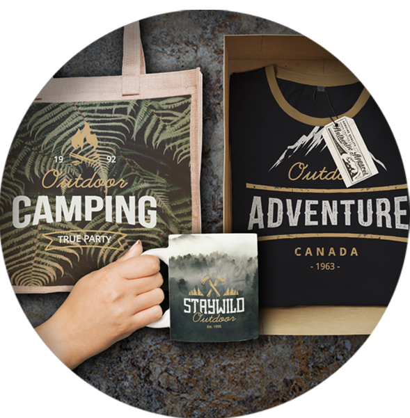
Merchandise
Posters & Signage
T-shirt Design
Glassware & Mugs
Waterbottles
Bags & Totes
Digital
Web Images
Social Media
Email Campaigns
Icons
Banners
ABOUT US
Decipher Design is a graphic design studio dedicated to working with you to arrive at an aesthetically beautiful visual solution that effectively embodies your idea.

What We Do
Decipher Design
We strive to make exceptional design available to everyone. We take pride in our process, our craft, and in creating a visually appealing and meaningful solution that makes your vision a reality.

How We Do It
Personalized Design
Our work is built around a close working partnership with our clients. Understanding, listening, and asking questions are as important to us as color and typography (which, to designers, are a big deal)!

Why We Do It
We Love Design
We believe that good design makes life better. Design has a major impact on the way everyone perceives and responds to the world they interact with daily. We love sharing our passion for design with our clients!
OUR PROCESS
We approach each project with a process centered around identifying your unique qualities and creating a visual solution that will engage your audience.

Tell Us
Begin with telling us as much as you can about your ideas in a design brief. No one understands your project and goals better than you do! The design brief makes sure we know them too as we design new ways to embody these goals.

Discuss Project
When you engage our studio, we become partners working towards a common goal - the realization of your idea. Once we've received and gone over your design brief, we will talk with you in person to cover any remaining questions and get to know you and your project.

Creative Concept
Next, we will sketch out concepts, share them with you to choose the best direction for your project, and develop a refined design tailored to suit your needs. Great design happens with care, not by chance. We employ creative tools, design principles, and careful selection of typography to craft elegant solutions for our clients.

Client Review
We will send the intial draft of your design to you for your feedback. It isn't uncommon to try several rounds of this step before finalization. We love what we do and we want you to love the result!

Production
When the final design has been approved, we will hand it over to you and/or a third party for production. This is where all the hard work produces a finished product to be proud of!

Happy Client
It's not just business, it's personal. We set out to connect people with what matters most - their vision - and we are united with you in the drive to realize the best design and outcome for your project.
OUR WORK
The design world is one of the most exciting places to be! It's an honor to connect and work with our inspired clients.
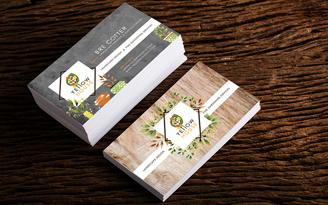
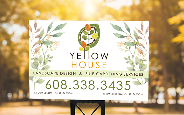
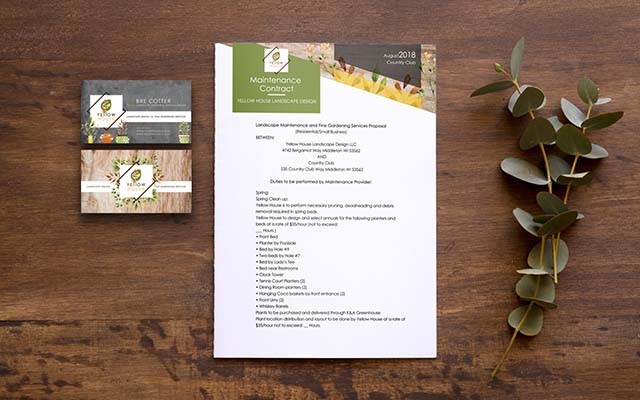
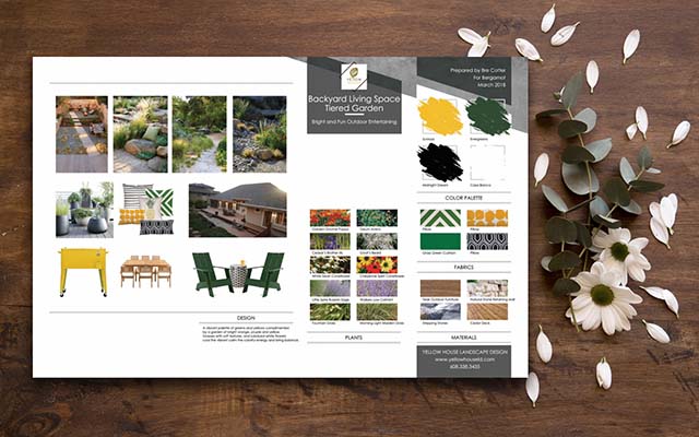
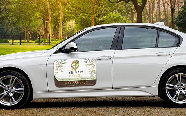
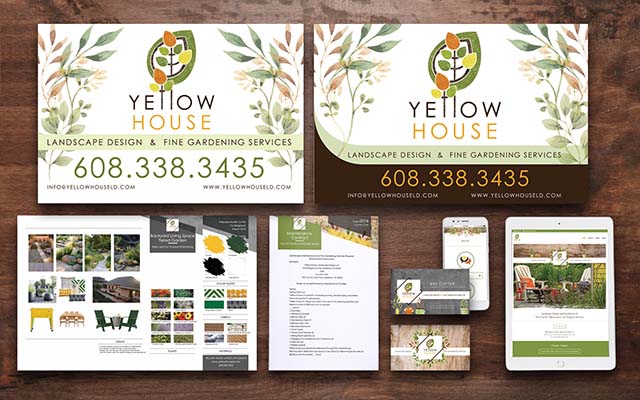
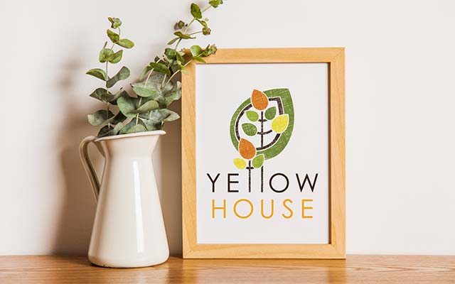
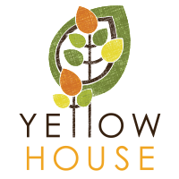
Yellow House Landscape Design
Yellow House is a landscape design and garden maintenance company, founded by Bre Cotter, whose energy and ingenuity are embodied in her designs. Her style is bold, but welcoming, modern and warm. The logo for Yellow House conveys her aesthetic through playful bold shapes, contemporary font, warm citrus colors, and an organic textured overlay, while the two lowercase “L” letterforms, morphing into trees, identifies the company as a landscaping business. The overall branding is sharp and elegant, communicating that the company offers high quality services.
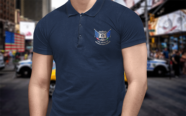
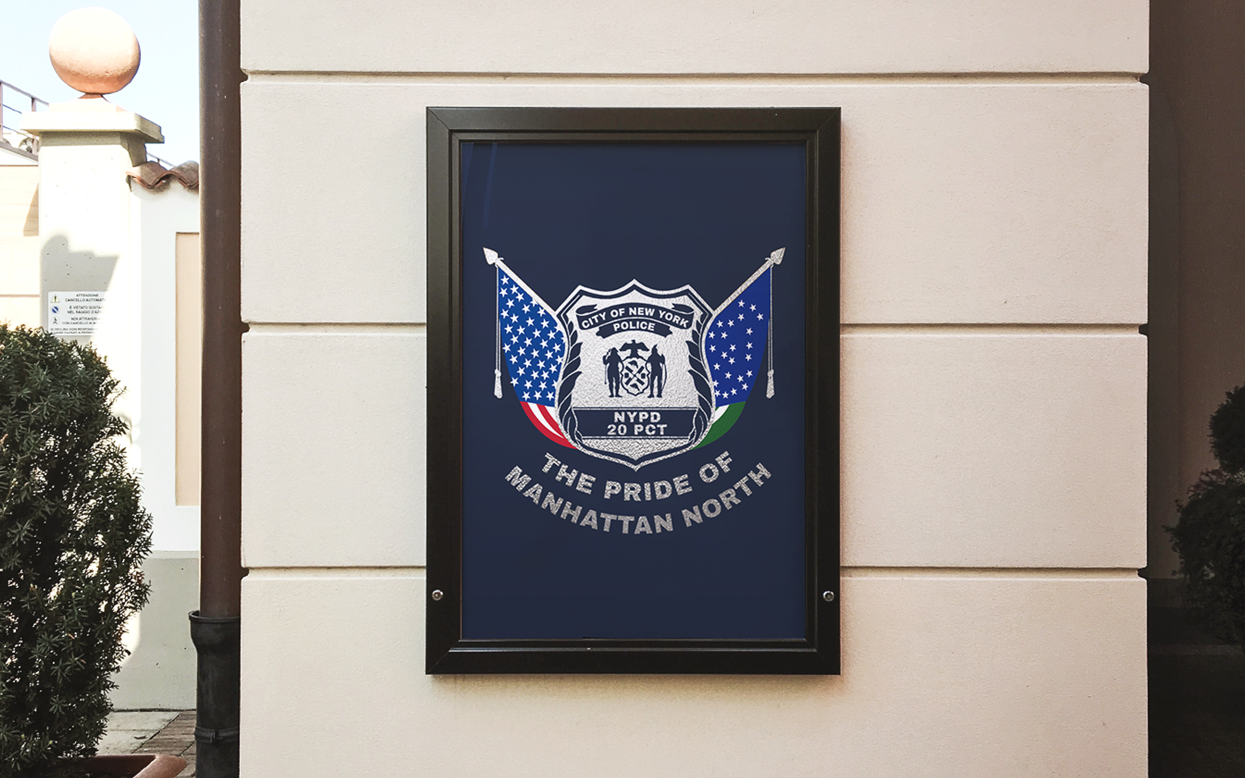
NYPD - 20th Precinct
NYPD - 20th Precinct Description
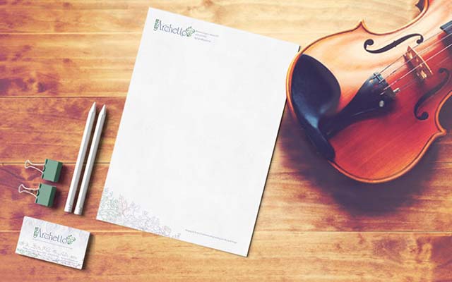
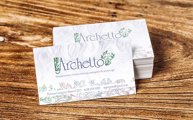
Archetto, LLC
Archetto is a web-based music instruction service, created by violist, Melissa Gregory-Simon. Her signature logo of a viola instrument combined with the viola flower, also our design, appears to the right, connecting the company with her own private music practice. The name Archetto is an Italian word, referencing stringed instruments. The logo design, references both vibrating strings and the music staff through the blurred horizontal lines threaded behind the word, while the letterforms rise and fall, suggesting musical notation. The intertwining forms of vines and flowers touch upon the design of illuminated Latin manuscripts and the carved relief detail on Baroque instruments. Deep purples, blues, and greens speak to the richness and history of the classical music studied here.
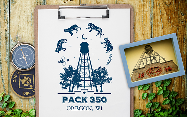
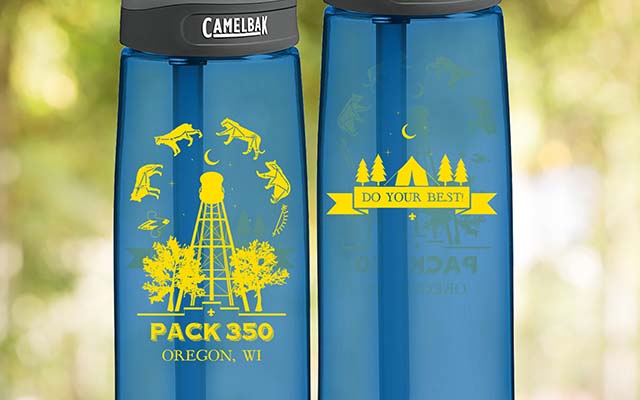
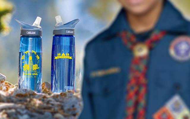
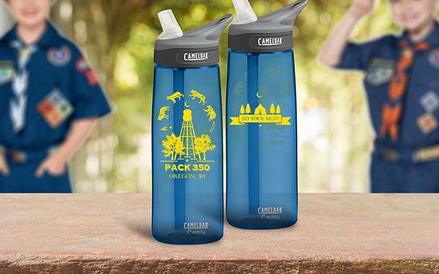
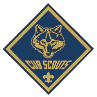
Cub Scout Pack 350
Cub Scout Pack 350 of Oregon, WI is a vibrant and active group, involved in and proud of their community, with a love for the outdoors. At the heart of the artwork created for the pack’s custom water bottle, stands the historic water tower, which is located at the center of downtown Oregon. In the sky above, the symbols for the six levels of achievement in Cub Scouts appear in an arc as constellations and are flanked by two oak trees, native to the area. The trees, tower, and open sky full of stars speak to outdoor adventuring life associated with scouting. The design is anchored at the bottom by a reference to the roofline of an old building located below the water tower on main street, the troop number and name of the city.
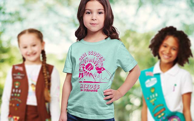
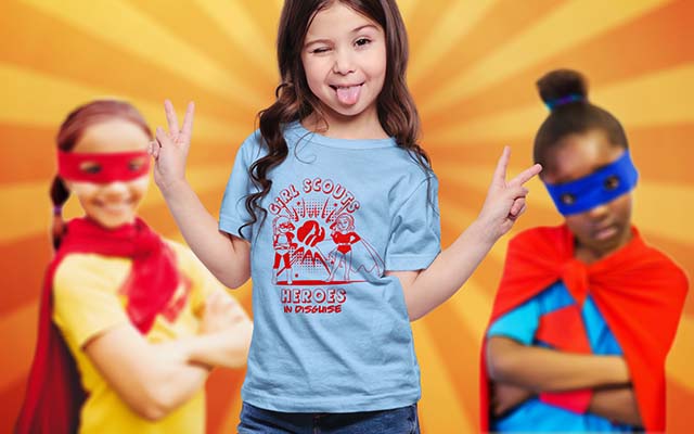
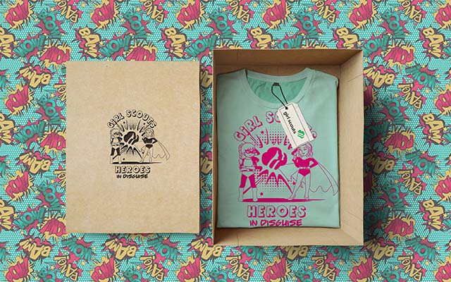
Girl Scout Camporee
Like any superhero, Girl Scouts are kind and courageous, serve their communities, stand up for others and fight for good causes. Through their efforts they strive to make the world a better place. In celebration of these qualities, “Girl Scouts, Superheroes In Disguise” was chosen as the theme of the Mount Horeb Girl Scout Camporee 2018. Two young girls dressed in hero costume stand confidently together in the artwork for this year’s Camporee shirt. Behind them, a pop art burst frames the Girl Scout logo, exuding power and strength, while heavy, angular text completes the comic book effect. The nature of the design is empowerment, while remaining childlike, in keeping with the age of the girls attending the camp.
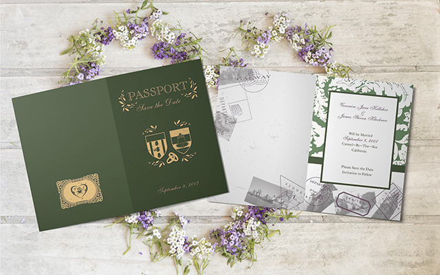
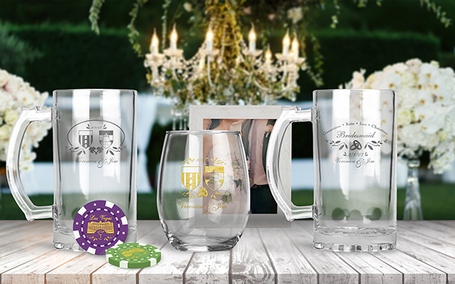
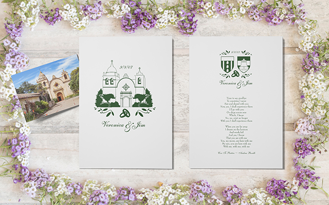
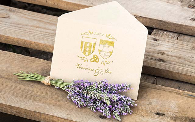
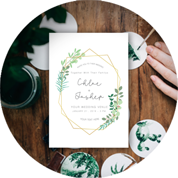
Kelleher-Kleckner Wedding
Kelleher-Kleckner Wedding Description
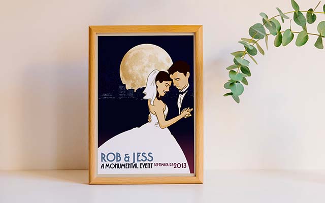
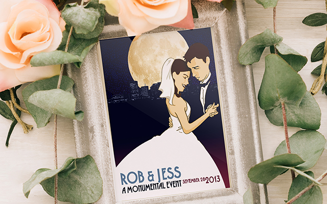
Stankus-Smith Wedding
Jessica and Rob Smith’s special day was held in picturesque Richmond, VA in the sophisticated Monumental Church with reception following at the historic Tredegar Iron Works. The mood of their wedding was elegant and classic with lux traces of Gatsby-esque flair. Their Save the Date set the tone, based on the art method of Art Deco poster prints. Stylized illustrations of the bride and groom, modeled from photographs, dance before the skyline of Richmond. Rob’s tuxedo melds with the dark backdrop, while Jessica’s bridal gown, in sharp contrast, creates the framework for the type bearing the details of the event.
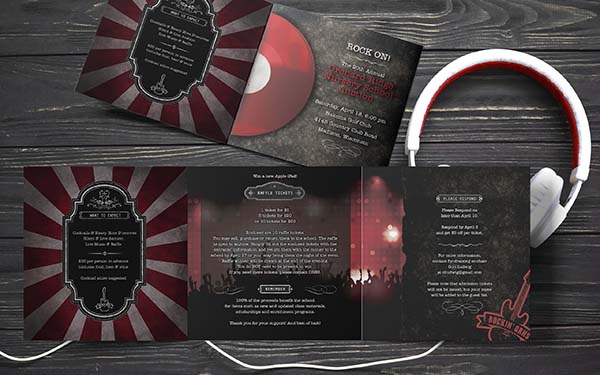
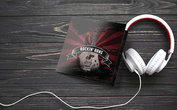
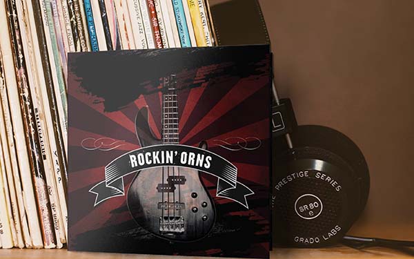
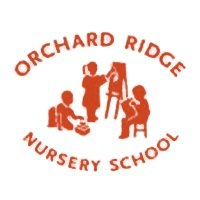
Orchard Ridge Nursery School
The annual silent auction held by Orchard Ridge Nursery School is the central fundraising and social event of the year for the community of families that attend the private school. It is a luxurious affair. The theme for the evening is Rock’n O.R.N.S. Grunge backgrounds and bokeh light effects behind the dark profiles of dancers evoke the feeling of a concert, juxtaposed to the more classic fonts and elements of the text of the invitation which underscore the formal nature of the occasion. A black, gray and red palette, avoids singling out any one era or genre of rock music, while still conveying the edge and clublike atmosphere that attendees will anticipate partaking in at the event.
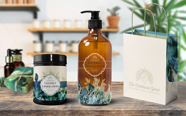
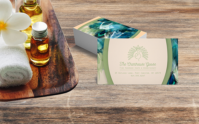
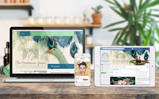
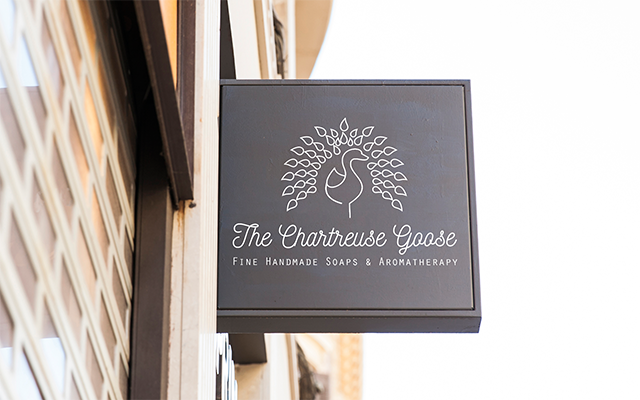
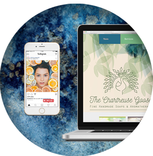
Chartreuse Goose
The Chartruese Goose is a (concept for) a locally owned, handmade soap and aromatherapy shop, represented by the form of a goose with a peacock’s tail. The monoline aesthetic of the logo conveys that elegant simplicity, calm and purity can be yours when you make use of the brand’s products. Peacocks symbolize luxury. The incongruous pairing of a goose and peacock, mischievously draws the customer in while promising a luxurious experience with a unique twist. Business cards, packaging, web images and social media all bear the brand’s signature pattern of deep blue and green feathers against a pure off-white background, a palette that speaks of luxury and simplicity coming together seamlessly as one.
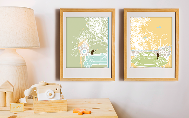
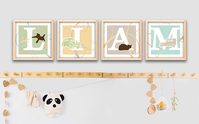
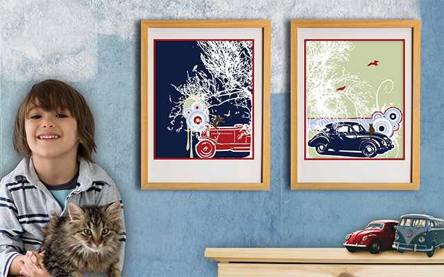
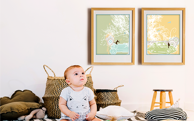
Nursery Artwork
The parents of little Liam were looking for artwork with a personal twist to fill walls of their baby boy’s nursery. At 12 months old, what did he love? Toy cars and the family cats. The subsequent compositions portray scenes of classic cars and cats chasing birds, in the soft pastels and mahogany colors of his room. Rippling bullseye patterns and dripping paint add a playfulness to the flat art style that will grow with the little boy. As Liam grew, the bedroom’s color scheme changed, but his first two loves did not, and the artwork was updated from the soft pastels of babyhood to the vibrant red, blue, and green of a young boy.
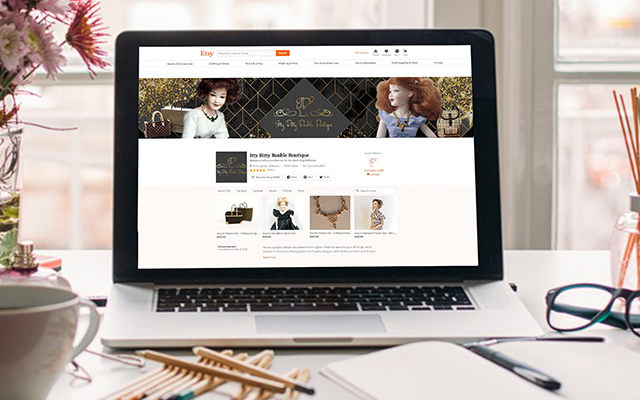

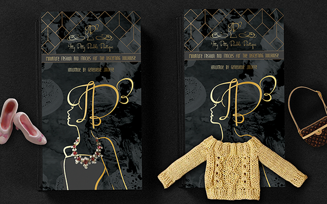
IB3: Itty Bitty Bauble Boutique
Itty Bitty Bauble Boutique Description
WHAT OUR CLIENTS SAY
-
Testimonial Pending
 Timothy Malin
Captain, NYPD - 20th Precinct
Timothy Malin
Captain, NYPD - 20th Precinct
-
Testimonial Pending
 Bre Cotter
Owner, Yellow House
Bre Cotter
Owner, Yellow House
-
"Veronica listened to our needs and brought the design ideas together flawlessly! She is extremely responsive and a pleasure to do business with!"
 Laura Lieven
Troop Leader, Girl Scout Troop xxx
Laura Lieven
Troop Leader, Girl Scout Troop xxx
-
Testimonial Pending
 Liz Burke
Director, Orchard Ridge Nursery School
Liz Burke
Director, Orchard Ridge Nursery School
-
Testimonial Pending
 Jessica Smith
Bride
Jessica Smith
Bride
-
Testimonial Pending
 Ryan Paulsrud
Cubmaster, Cub Scout Pack 350
Ryan Paulsrud
Cubmaster, Cub Scout Pack 350
Owner, AlphaGraphics
CONTACT US
If you have any questions, comments, or just a shared aversion to Comic Sans, please drop us a line!
Say Hello
creative@decipherdesign.net
+1 608 909 1517
1544 Blue Heron Way, Oregon, WI 53575


